
Apple has dropped a bomb with iOS 26 and its new Liquid Glass look, a facelift that completely transforms the iPhone interface with translucent panels, floating layers and blurs that look like they’re straight out of a futuristic demo. It’s bright, eye-catching and impossible not to look at twice; however, the question we ask at ActualApp is unavoidable: is this pure visual fireworks or a change you should actually install right now?
What changes with Liquid Glass in iOS 26
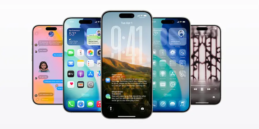
Liquid Glass replaces the flat approach we’ve seen since the iOS 7 era with a fluid aesthetic, featuring windows, widgets and notifications that overlap like sheets of glass. The result is very striking, with a sense of depth reminiscent of Windows Vista’s Aero Glass era, albeit with a more polished touch suited to 2025. Widgets also appear to truly float above the background, with transitions that blur and bring coherence to the whole.
This shift is not just an icon theme: the new visual identity splashes across almost every corner of the system, from the lock screen to everyday apps. If you like expressive interface design like Android’s Material You, you’ll find that same ambition here to make the whole system “breathe” together. In fact, the overall feeling is that the iPhone feels different as soon as you unlock it.
That said, such a paradigm change implies an adjustment curve and more room for rough edges to appear in the experience. When you touch the visual skeleton of an entire operating system, it’s normal for details that need polishing to surface in the first weeks, and that conditions the decision to update on day one.
Reading and accessibility: the flip side of the glass effect
Transparencies freshen up the interface and look great in screenshots, but not everything is advantageous in real use. Changing backgrounds and translucent layers can hinder readability in common situations, like going outside in bright light or for users who need maximum text and symbol sharpness. Early tests have noted that everyday elements such as the search field in Messages and Mail can blend with what’s behind them, reducing contrast just when it’s most needed.
Something similar can happen with lock screen notifications: the frosted effect looks nice, but forces you to “look through” and makes information require extra effort for a quick glance. Apple has championed accessibility for years and offers fine adjustments to adapt the iPhone to each user; however, this new visual approach risks complicating daily life for those who prioritize clarity and legibility over aesthetics.
In other words, what looks flawless on stage may force you to focus more or adjust your workflow in everyday use. If your priority is quick reading, fewer tapping mistakes and not missing alerts, it’s worth bearing these implications in mind before rushing to install.

Update now or wait a few weeks?
Beyond design, it’s wise to consider how a major new version behaves in real life. With such a deep change, it’s common for initial bugs to appear, small app incompatibilities or erratic battery consumption that are later fixed with early updates. Developers also need time to adapt interfaces and behaviors to the new transparencies and layers, so waiting can save you unnecessary stumbles.
Another key point is the feature distribution depending on the iPhone you have. Older models receive the Liquid Glass look and some new features like Call Screening, but miss out on the advanced Apple Intelligence capabilities; we’re talking about tools like Live Translation or Visual Intelligence, which uses the camera to recognize objects. In that scenario, the update can feel more “cosmetic than substantial,” because you accept the interface change without getting the full package of intelligent improvements. For many, that balance isn’t worth it.
And if your iPhone is compatible with the full Apple Intelligence rollout? Even then, the sensible recommendation is the same: wait a bit for Apple to polish the inevitable rough edges of the launch and for the app ecosystem to settle. The good news is there’s no rush; Apple lets you stay on the latest iOS 18 iteration or jump to iOS 26 over the coming weeks or even months, so you can decide calmly and without FOMO.
In summary, iOS 26 is the most ambitious visual change we’ve seen in years—capable of enchanting at first sight while also raising reasonable doubts in daily use. If you crave the novelty and accept possible bugs, go ahead; if you prefer stability, readability and zero surprises, giving Apple some time will be the best move. So, do you dive into the liquid glass or wait for it to settle?
